GEOSTAT CARTO Tutorial GEOSTAT 2016
- Trainer: Jorge Sanz · jorge@carto.com · @xurxosanz
- September 21st, 2016
- CARTO Tutorial about the Builder and Engine
- http://bit.ly/160921-geostat-carto
Introduction
Prerequisites
- A modern browser (Google Chrome would be perfect)
- Postman if you want to play with CARTO APIs, but you can use
curlor any other decent HTTP client (desirable) - A HTML/JavaScript capable text editor like Notepad++, gedit, sublime text, atom, etc (optional)
Map Academy, tutorials and other online resources
You can take a look on those resources if you want to warm up with CARTO
Further questions and troubleshooting
- Email to support@cartodb.com.
- Some questions could be already anwered at GIS Stack Exchange
cartotag.
Contents
Accounts set up
- The instructor will provide you a user and passwor to access your account
- Log into your
geostatXXaccount going tohttps://geostatXX.carto.com
Introduction to CARTO
Slides available here

Builder
The Builder is the new main web interface to interact with the CARTO platform. It’s a product aimed to everyone willing to manage, analyze and visualize geospatial information. It’s highly focused on usability, with a friendly graphical interface that unlocks all the power of the CARTO Engine without having to know all the details on underlying technologies such as PostGIS or CartoCSS.
Simple exercise: San Francisco tree map
- Degree of Difficulty: **
- Goal: Display the different kinds of trees in San Francisco and when they were planted.
- Features Highlighted:
- Widgets: Category and time-series widget.
- Datasests needed:
- sf_trees dataset from the San Francisco Trees map
1. Import and create map
1. 1. Import the Street Tree List as a csv file into your dataset dashboard.
- Download the dataset as a CSV
- Go to your account and import is using the
NEW DATASETwizard
1. 2. Dataset view
- Take a look on the dataset
- Switch between the metadata and the SQL view, try any simple query like limiting the result.
- Take a look on the spatial distribution using the
PREVIEWwindow.
1. 3. Click on CREATE MAP from the Street Tree List dataset.
- Change the name of the map to
San Francisco Trees
Warning: after renaming a layer a error could pop up saying “the map cannot be rendered”, don’t worry about this. Refresh the page and it will dissapear.
2. Layers and styles
2. 1. Ordering of the layers in the Builder
-
Change the basemap to the dark_matter (labels below) basemap and check the different basemaps options.
-
Note how the layer we added gets the
a0identifier. This is not important now but it will be later when adding analysis and widgets.
2. 2. Layer options
DATA:- This interface gives a general view of the fields the layer, its name and its data type but also from there you can add them as widgets.
- Switch to
VALUEStoSQL. The SQL panel allows more advanced users to manage data in a more precise way. - Finally, use the button in the bottom center of the map to switch between the table and the map view.
STYLE:- In the
Aggregation menu, select theNoneoption. - In the
Filloptions, select theBy Valueoption and then choose thecommon_speciesoption to color the dots depending on the values of thecommon_speciesvalues. - Change the size of the dots to 3 and change the stroke value of the points to 0.
- In the

POP-UPS:- Select the Hover tab and the light style for the hover infowindow.
- In the
Show Itemssection of the hover menu, select thecommon_speciesfield and change its name to Common Species. - By doing this, a pop-up will appear when we hover over the points on the map.

3. Widgets
3. 1. Category Widget
- Back to the main menu, select the
WIDGETStab and select theADD WIDGET. - In the options of the
Categorytab, select thecommon_speciesandcaretakercheckboxes in order to have widgets that display the different categories of thecommon_speciesandcaretakerfields. ClickCONTINUEto add the widgets on the map.

3. 2. Time series widget
- Back to the main menu, select the
WIDGETStab and select theADD WIDGET. - In the options of the
Time-seriestab, select theplant_datecheckbox in order to display the dates were the trees were planted. ClickCONTINUEto add the widgets on the map.

3. 3. Change order and name of widgets
- Back to the main menu, select the
WIDGETStab to see a list with the widgets that we have added. - We can drag and drop the widgets in the widget menu to change their order.

- We can change the name of our widgets by selecting the
renameoption of the widget menu or by doing a double click on the widget name in the widgets menu.

- Change the name of the
common_specieswidget toCommon Species, the name of thecaretakerwidget toCaretakerand the name of theplant_datewidget toPlant Date.

4. Share map
- At the bottom of the main menu, click the
Sharebutton. - Select the
Publishtab and click on thePublishbutton that is below the Map title in order to share our map.

- After clicking the
Publishbutton, we can select the option that we want to share our map.

Analysis exercise: sales territories
- Degree of Difficulty: ***.
- Goal: Find the best place to create a store near the customers.
- Features Highlighted:
- Analysis: Cluster Analysis, Weight Centroid Analysis, Area of influence analysis and Filter Points in polygons analysis.
- Widgets: Formula widget and histogram widget.
- Datasests needed:
- Customer locations dataset
customer_home_locationsfrom Sales Territories (Portland) Demo.
- Customer locations dataset
1. Import and create map
1. 1. Import customer_home_locations csv.
- Use the
NEW DATASETwizard to import the table.
1. 2. Click on CREATE MAP from the customer_home_locations.
1. 3. Rename customer_home_locations to Customer home locations and change the title of the map to Sales Territories (Portland) Demo.
Warning: after renaming a layer a error could pop up saying “the map cannot be rendered”, don’t worry about this. Refresh the page and it will dissapear.
- You should have a dashboard like this:

2. Layer styling: first view
On this example we will start with a single color styling and fixed marker size.
- Change the fill color to
#cc1035and set the size of the markers to 7. - Set the stroke of the points to 0.
- Switch to
VALUEStoCARTOCSS. Take a look on the CartoCSS properties and try to change any of them like increasing the width of the marker.

3. Analysis
3. 1. Cluster Analysis
-
Back to the main menu of the layers, select the
customer_home_locationslayer and click onADD ANALYSISoption. -
From the analysis menu, select the
Calculate cluster pointsanalysis and click onADD ANALYSIS.

- In the
ANALYSEStab of the layer, we have three sections:- Workflow: Is an overview of the analysis that we apply to the layer, so you can have more than one. The analysis should have the name
A1to indicate that is the first analysis applied to the layer. - Source: asks for the geometry where we will calculate the cluster of the
customer_home_locationslayer. - Parameters: Define the number of possible stores that you want. We set the number of clusters to 6.
- Workflow: Is an overview of the analysis that we apply to the layer, so you can have more than one. The analysis should have the name

- After clicking
Apply, CARTO will return the result of theCalculate cluster pointsanalysis. After finishing the analysis, CARTO will return the same number of points on the map, but with an extra column calledcluster_no. - In order to have a better understanding of the result of the
Calculate cluster pointsanalysis and see how the points are grouped, we should change the fill option of the points (in theStyletab) according to the value of thecluster_nocolumn using theBY VALUEoption:

3. 2. Weight Centroid Analysis
- We will apply the analysis to the result of the
Calculate cluster pointsanalysis, so we will go back to the main menu and we will click on theADD ANALYSISoption of thecustomer_home_locationslayer. - We will select the
Find centroid of geometriesanalysis.

- In the
ANALYSEStab of the layer, we have two sections:- Workflow: Now, because we are applying a second analysis to the
customer_home_locationslayer, the workflow has changed.A1represent the cluster analysis, but now we have a new analysis namedA2to indicate that is the second analysis applied to the layer. - Centroid:
- Source: we indicate that we are using as the source, the results from the
Calculate cluster pointsanalysis. The source is not the original points of the layer, but the points that we got after theCalculate cluster pointsanalysis.
- Source: we indicate that we are using as the source, the results from the
- Parameters: to set how we want to calculate the centroids of the cluster data. We will select the
Categorized byoption using thecluster_nocolumn, we will also select theAggregated byparameter to aggregate the result using the average of thecustomer_valuecolumn and finally we will select theWeigthted byparameter using thecustomer_valuecolumn to indicate the column that we want to use to calculate the centroids of the clustered regions.
- Workflow: Now, because we are applying a second analysis to the

- After clicking
Apply, we should see a result where we can see the centroids of the clustered areas from the Cluster Analysis

3. 2. 1. Improve visualization
- We could style our resulting points by changing the size and the color according to the resulting aggregated values.

- We also could add a popup to the layer, so for each point we can display its value. In order to do this we go to the
Popuptab and we select thehoveroption to display the popup when we mouse over the centroids. We select the columnvalueto display its values in the popup. We also will change the name that will be displayed on the popup toAVG. CUSTOMER VALUE.

- Back to the main menu, in the
Layerstab,we drag and drop the Cluster node analysis outside of the layer (layer A1) to create a new data layer with the customer locations (layer B).By doing this, we will have on the map a layer with the clustered points and a layer with their centroids.

- Now, we change the name of the layers. The name of Layer A will be
Centroidsand the name of layer B will beCustomer Locations. Then, we change the style of theCustomer Locationslayer using the values from the columncluster_noin order to style the points depending on the cluster they belong to.

3. 3. Area of influence analysis
- We will apply the analysis to the result of the Centroid Analysis.We will go back to the main menu and we will click on the
ADD ANALYSISoption of theCentroidslayer (A). - We will select the
Create areas of influenceanalysis.

- In the
ANALYSEStab of the layer, we have three sections:- Workflow: Now, because we are applying a third analysis to the
Centroidslayer, the workflow has changed.A1represent the cluster analysis,A2represent the Centroid analysis andA3indicates the third analysis applied to the layer. - Create areas of influence:
- Input: we indicate that we are using as the input, the results from the
Centroidanalysis. The input is not the original points of the layer, but the points that we got after theCentroidanalysis.
- Input: we indicate that we are using as the input, the results from the
- Parameters: define the distance of the area of influence, the type of units, the radius and the boundaries. The boundaries might be
intactordissolved. If we choose theintactoption, that means that if our areas of influence polygons overlap, then they will keep their original polygon borders. On the other hand, if we choose thedissolveoption, if the areas of influence polygons overlap, they will be merged so the result will be one big polygon. We set the units to kilometres, set the radius to1kilometre and choose theintactoption for theboundariesparameter.
- Workflow: Now, because we are applying a third analysis to the
- After clicking
Apply, we should see a result where we can see the areas of influence of 100 meters around the subway stations:

3. 3. 1. Improve visualization
- Back to the main menu, in the
Layerstab,we drag and drop the Area of influence node analysis outside of layer (A3) to create a new Data layer with the areas of influence (C). The new layer (C) will have the same name as the layer A, we will change the name of layer C toAreas of Influence.

3. 4. Filter Points in polygons analysis
- We will apply the analysis to the
Areas of Influencelayer, so we clickADD ANALYSISoption of that layer and we select theFilter points in polygonsoption.

- In the
ANALYSEStab of the layer, we have two sections:- Workflow: Now, because we are applying a second analysis to the
Areas of Influencelayer, the workflow has changed.B1represent the area of influence analysis, but now we have a new analysis namedB2to indicate that is the second analysis applied to the layer. - Filter points in polygons:
- Source: we indicate that we are using as the source, the results from the
area of influenceanalysis. The source is not the original points of the layer, but the polygons that we got after thearea of influenceanalysis. - Target Layer: is the
Clusterslayer (B1).
- Source: we indicate that we are using as the source, the results from the
- Workflow: Now, because we are applying a second analysis to the
- After clicking
Apply, we should see a result where instead of the circles we had before on ourAreas of InfluenceLayer, we should have now points referring to customers within thoseAreas of Influence. The result is indicating the customers that are closer to the stores.

4. Widgets
4. 1. Formula widget
- Back to the main menu, select the WIDGETS tab and select the ADD WIDGET option.
- In the options of the Formula tab, select the
cartodb_idcolumn of the B1 layer and we click onCONTINUE.

- In the widget menu, we set the
OPERATIONparameter tocountand we change the name of the widget toTotal Customers.

- Back to the main menu, select the WIDGETS tab and select the ADD WIDGET option.
- In the options of the Formula tab, select the
cartodb_idof the C2 layer.

- In the widget menu, we set the
OPERATIONparameter tocountand we change the name of the widget toCustomers within Areas of influence.

4. 2. Histogram widget
- Back to the main menu, select the WIDGETS tab and select the ADD WIDGET option.
- In the options of the Histogram tab, select the
customer_valueof the B1 layer and we click onCONTINUE.

- We should get a “U shape” histogram:

- Go back to the main menu, and filter your map with the histogram. Watch how the map changes !

Analysis exercise: railways risk analysis
- Degree of Difficulty: ***
- Goal: what US counties have higher risk for insuring railroad companies.
- Features Highlighted:
- Widgets: Category, Formula and Time Series.
- Analysis: Intersect, Outliers & Cluster analysis.
- Datasests needed:
- Railroad accidents (
dot_rail_safety_data): download it from thebuilder-demoCARTO account and import it into CARTO from your local machine. - US counties (
cb_2013_us_county_500k): search and connect via Data Library.
- Railroad accidents (
1. Import and create a map
- Import the
dot_rail_safety_datacsv file into your dataset dashboard. - Create a new map with it
- You should have a dashboard like this:

2. Style layer
FILL: click on the marker size, selectBY VALUE, settotal_damageas the variable and choose a color.- Change the
STROKEto 0. - Switch to
VALUEStoCARTOCSS. With the CartoCSS panel advanced users are allowed to layer style in a more precise way.
Switch to the CartoCSS view and check how the quantitative map has been defined. You’ll see a
ramp()function. This is TurboCarto, our CartoCSS processor that helps creating parametric symbolization based on column values. Learn more about TurboCarto in this awesome blog post by our senior cartographer Mamata Akella.

3. Add widgets
3. 1. Back to the main menu, select WIDGETS
ADD WIDGET:- Railroad Companies Category Widget: select
Category, chooserailroad, and click onCONTINUE. In order to rename the widget, come back to the list of widgets and double click on the name and rename it as “Railroad Companies”.- Take a look on how CARTO Builder sets a connection between vizualization and widgets. This connection is bidirectional, the map changes widgets values and clicking on categories changes the map.
- Click on the
Auto styledroplet button to see how each dot is colored according to its category. - Disable the
Auto styleto come back to the default visualization.
- Railroad Companies Category Widget: select

- Total Damage Formula Widget: select
Formula, choosetotal_damage, and click onCONTINUEand setOPERATIONtosumand add$asPREFIX. In order to rename the widget, come back to the list of widgets and double click on the name and rename it as “Total damage”.- Again, experimient with the connection between visualization and widgets.
- Try to filter by company and see how the total damage widget is updated automatically.
- Change the order of the widgets, you can prioritize visually one over another.

- Date Time Series Widget: select
Time Series, choosedate, and click onCONTINUEin order to rename the widget.

4. Add US counties layer, start the analysis
4. 1. Back to the main menu, select LAYERS, then ADD
- Click on
DATA LIBRARY, type “counties” on theSEARCHbar, select thecb_2013_us_county_500kdataset and finally, click onADD LAYER. - Rename the new layer to “US Counties”.
4. 2. Click on “US Counties” layer, ANALYSES, ADD ANALYSIS
- Select
Intersect second layer: this analysis performs a spatial intersection and aggregates the geometry values from the target layer that intersect with the geometry of the source layer..- Select “Railroad accidents” as
TARGET LAYERandSUM(total_damage)asOPERATION. Apply. - When the analysis is done, an explanatory window will pop up. Click on
DONE.
- Select “Railroad accidents” as
Warning: if you have not run this analysis before, you could encounter a well known bug. This consist on that instead of polygons, you get points. You can get the right geometry changing the style of the layer.
- First, using the map take a look on the results of the analysis: only the counties overlapping with data points are showed. Secondly, go to the dataset view to show the new column created with the previous analysis,
sum_total_damage.

-
Sum Total Damage Histogram Widget: from the same
DATAsection, check theAdd as a widgetbox of thesum_total_damagefield andEDIT. This will create a new histogram widget. Set the buckets to7and rename it as “Sum Total Damage”. -
Use the autostyling and removing the visibility of the “Railroad accidents” layer. Remove auto style again. Go back to the main menu.

5. Continue the analysis, get outliers and clusters
5. 1. Click on ADD ANALYSIS just below “US Counties”
- Select
Detect outliers and clusters: this analysis finds areas in your data where clusters of high values or low values exist, as well as areas which are dissimilar from their neighbors.- Select
sum_total_damageasTARGET COLUMNand leave the rest of parameters with the default values. Apply. - Again, when the analysis is done, an explanatory window will pop up. Click on
DONE.
- Select
-
First, using the map show the viewer the results of the analysis: only the counties considered by the analysis as outliers or clusters are showed. Secondly, go to the dataset view to show the new columns created with the previous analysis,
quadis the column more interesting because contains the groups that the analysis has made: HHandLL: clusters of high or low values surrounded by similar valuesHLandLH: outliers of high or low values surrounded by opposite values

-
We are going to add a last widget, Sum Total Damage Histogram Widget: click on
WIDGETS,ADD,Categoryand selectquads.CONTINUE. Rename it as “Groups”. -
Filter by
HHandHLcounties. Those are counties with high value of total damage surrounded by counties with also high values, and counties with high value of total damage surrounded by counties with low values. Click onAuto styleto better distinguish them. Remove the auto style.

6. Share and export your results
6. 1. Back to the main menu, click on the three dots on the “US Counties” layer
- Select
Export data, chooseCSV. - Open (with Excel or another similar software) the csv file you just download
US_Counties.csv. Collapsethe_geomcolumn. You should have 39 counties/rows, containing onlyHHandHLvalues.

6. 2. Back to the main menu, show the publish dialogs
- Below the map title it should show
PRIVATE,ADD PEOPLEandMap not published yet. Let’s change that.- First, click on
PRIVATE, and again. SelectLink. - Secondly, click on
SHARE(at the bottom of the main menu). Click onPUBLISH, and thenDONE. - Get the link and past it into your browser.
- First, click on
The dashboard should show your “Railroad accidents” as green dots with sizes depending on the total damage. In addition, all the groups of counties will be displayed. This is because the filters and auto styling you did, it is not applied. Finally, you will have four widgets but in different order.

- Back to the main menu, click on “US Counties” layer. Go to the
STYLEtab. Style the layer with aFILLBY VALUE. Selectquadsas variable and choose a couple of colors that can be easily distinguished. - Click again on
SHAREand now inUPDATE. - Now if you go back to your browser tab where you have pasted the link nothing has changed. But if you refresh the page, voilá! The colors have modified.

Engine
Spatial SQL
On this section you’ll have the chance to test some of the most common PostGIS SQL procedures. To follow this section you only need to open a browser pointing to this url: http://bl.ocks.org/jsanz/raw/fcb8394e084919a4135188b7c30504ad/ and change the Maps API entry point to http://geostat-api.carto.com/api/v1/map.
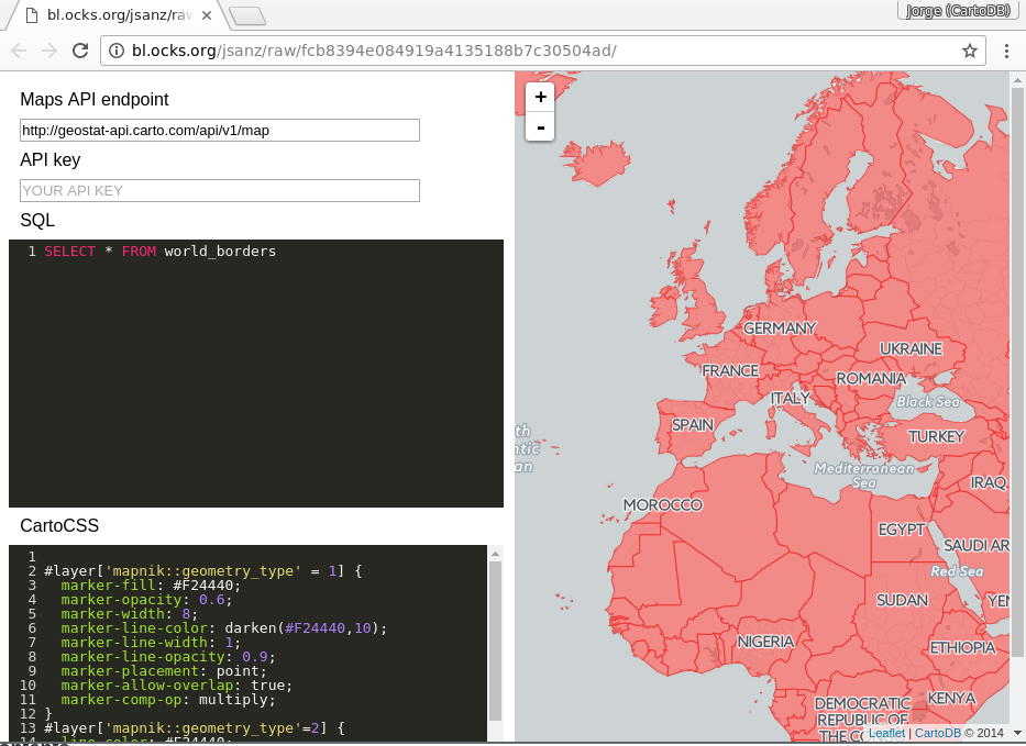
From that point, you can place any valid query on the SQL panel that plays with the following datasets from Natural Earth
ne_50m_landne_adm0_europene_10m_populated_places_simple
Over different examples we’ll see how to make buffers, intersect or calculate lines between different features of those tables. You can paste the SQL presented on the panel, make changes and see how it works saving them using Control+S or Command+S depending on your operating system.
If no data shows on your map open the developer console and look for any errors. Usually when there’s an error on your SQL statement the API will return a message that may help on finding the issue.
This section assumes some basic knowledge on SQL. If you need a bit more of help on the basics of this language take a look on this workshop, there’s a section on simple SQL queries.
Contents
- Transform to a different projection
- Get the number of points inside a polygon
- Know wether a geometry is within the given range from another geometry:
- Create a buffer from points:
- Get the difference between two geometries:
- Create a straight line between two points:
- Create great circles between two points:
- Generating Grids with CDB functions
Transform to a different projection
SELECT
  cartodb_id,
  ST_Transform(the_geom, 54030) AS the_geom_webmercator
FROM
  ne_50m_land
About working with different projections in CARTO and ST_Transform.
Get the number of points inside a polygon
Using GROUP BY:
SELECT
  e.cartodb_id,
  e.admin,
  e.the_geom_webmercator,
  count(*) AS pp_count,
  sum(p.pop_max) as sum_pop
FROM
  ne_adm0_europe e
JOIN
  ne_10m_populated_places_simple p
ON
  ST_Intersects(p.the_geom, e.the_geom)
GROUP BY
  e.cartodb_id
Using LATERAL:
SELECT
  a.cartodb_id,
  a.admin AS name,
  a.the_geom_webmercator,
  counts.number_cities AS pp_count,
  counts.sum_pop
FROM
  ne_adm0_europe a
CROSS JOIN LATERAL
  (
    SELECT
      count(*) as number_cities,
      sum(pop_max) as sum_pop
    FROM
      ne_10m_populated_places_simple b
    WHERE
      ST_Intersects(a.the_geom, b.the_geom)
  ) AS counts
About ST_Intersects and Lateral JOIN
Note: Add this piece of CartoCSS at the end so you have a nice coropleth map:
#layer['mapnik::geometry_type'=3] {
  line-width: 0;
  polygon-fill: ramp([pp_count], ("#edd9a3","#f99178","#ea4f88","#a431a0","#4b2991"), quantiles(5));
}
This is using the new turbo-carto feature on CARTO to allow creating ramps from data without having to put the styles directly
Note: You know about the EXPLAIN ANALYZE function? use it to take a look on how both queries are pretty similar in terms of performance.
Know wether a geometry is within the given range from another geometry:
SELECT
  a.*
FROM
  ne_10m_populated_places_simple a,
  ne_10m_populated_places_simple b
WHERE
    a.cartodb_id != b.cartodb_id
  AND ST_DWithin(
      a.the_geom_webmercator,
      b.the_geom_webmercator,
      150000
    )
  AND a.adm0name = 'Spain'
  AND b.adm0name = 'Spain'
In this case, we are using the_geom_webmercator to avoid casting to geography type. Calculations made with geometry type takes the CRS units.
Keep in mind that CRS units in webmercator are not meters, and they depend directly on the latitude.
About ST_DWithin.
Create a buffer from points:
SELECT
  cartodb_id,
  name,
  ST_Transform(
    ST_Buffer(the_geom::geography, 250000)::geometry
    ,3857
  ) AS the_geom_webmercator
FROM
  ne_10m_populated_places_simple
WHERE
  name ilike 'trondheim'
Compare the result with
SELECT
  cartodb_id,
  name,
  ST_Transform(
    ST_Buffer(the_geom, 2)
    ,3857
  ) AS the_geom_webmercator
FROM
  ne_10m_populated_places_simple
WHERE
  name ilike 'trondheim'
Why this is not a circle?
About ST_Buffer.
Get the difference between two geometries:
SELECT
  a.cartodb_id,
    ST_Difference(
        a.the_geom_webmercator,
        b.the_geom_webmercator
  ) AS the_geom_webmercator
FROM
  ne_50m_land a,
  ne_adm0_europe b
WHERE
  b.adm0_a3 like 'ESP'
About ST_Difference.
Create a straight line between two points:
SELECT
  ST_MakeLine(
    a.the_geom_webmercator,
    b.the_geom_webmercator
  ) as the_geom_webmercator
FROM (
    SELECT * FROM ne_10m_populated_places_simple
    WHERE name ILIKE 'madrid'
  ) as a,
  (
    SELECT * FROM ne_10m_populated_places_simple
    WHERE name ILIKE 'barcelona'AND adm0name ILIKE 'spain'
  ) as b
About ST_MakeLine.
Create great circles between two points:
SELECT
  ST_Transform(
    ST_Segmentize(
      ST_Makeline(
        a.the_geom,
        b.the_geom
      )::geography,
      100000
    )::geometry,
  3857
  ) as the_geom_webmercator
FROM
  (SELECT * FROM ne_10m_populated_places_simple
  WHERE name ILIKE 'madrid') as a,
  (SELECT * FROM ne_10m_populated_places_simple
  WHERE name ILIKE 'new york') as b
About Great Circles.
Generating Grids with CDB functions
Rectangular grid
SELECT
  row_number() over () as cartodb_id,
  CDB_RectangleGrid(
    ST_Buffer(the_geom_webmercator,125000),
  250000,
  250000
  ) AS the_geom_webmercator
FROM
  ne_adm0_europe
WHERE
  adm0_a3 IN ('ITA','GBR')
About CDB_RectangleGrid
Adaptative Hexagonal grid
WITH grid AS (
  SELECT
    row_number() over () as cartodb_id,
    CDB_HexagonGrid(
      ST_Buffer(the_geom_webmercator, 100000),
      100000
    ) AS the_geom_webmercator
  FROM
    ne_adm0_europe
  WHERE
    adm0_a3 IN ('ESP','ITA')
)
SELECT
  grid.the_geom_webmercator,
  grid.cartodb_id
FROM
  grid, ne_adm0_europe a
WHERE
  a.adm0_a3 IN ('ESP','ITA') AND
  ST_intersects(
    grid.the_geom_webmercator,
    a.the_geom_webmercator
  )
About CDB_HexagonGrid
Exploring CARTO Engine APIs
This section covers the basic usage of main CARTO Engine APIs. Using a software called Postman you’ll be able to experiment with the different APIs and see how to interact directly with the platform. This is specially useful if you are going to do it from a different environment than JavaScript, as it will be covered on the last part of this workshop.
Setting up your environment:
- Open your Postman installation (normally a Google Chrome extension)
- Install a new collection from this link
- Download the environment provided by the instructor (see the shared notes doc)
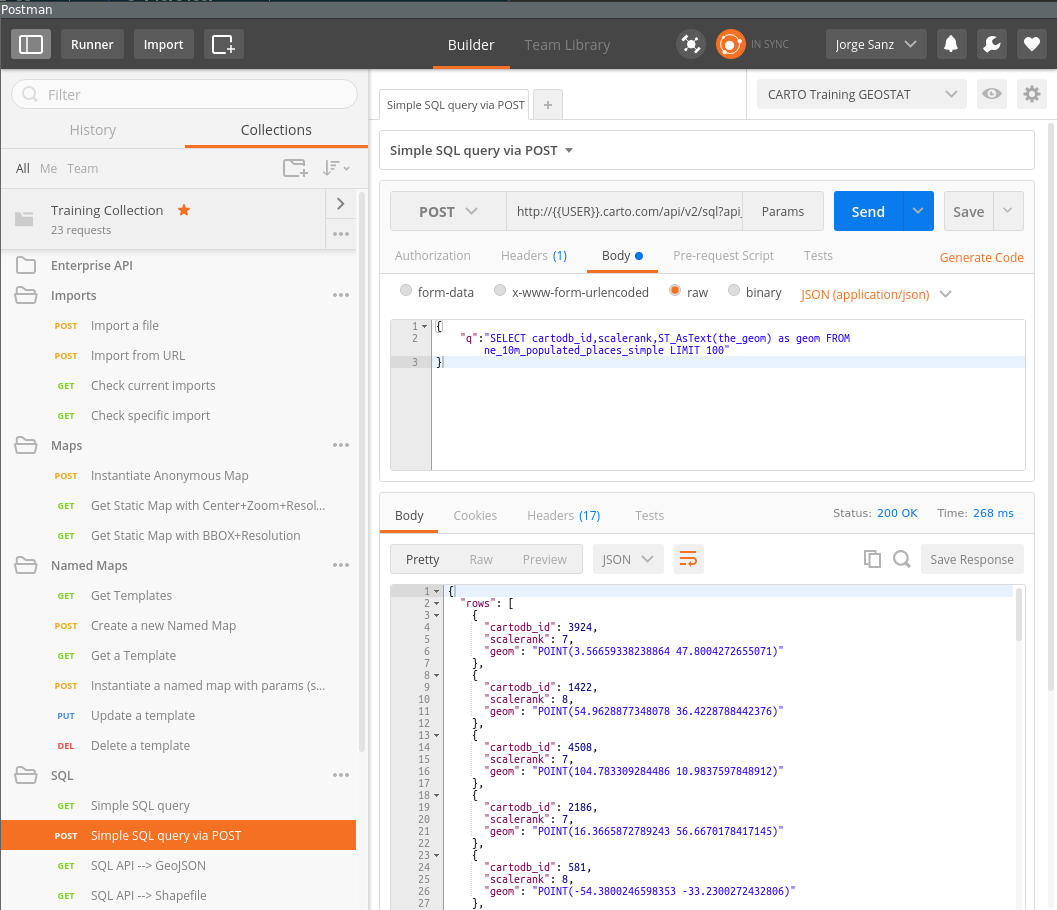
SQL API
This is the API to interact directly with your database. You can perform not just any SELECT query but also create tables, add triggers and functions.
Maps API
The Maps API is the rendering engine for CARTO. This API needs in essence a query and a cartographic symbology definition to render tiles to be used on your web mapping applications. When datasets are public (as in Free accounts) you can specify queries and CartoCSS directly on your call. When private datasets are involved, then you need to define a template and give it a name to be instantiated by the final users.
Import API
To upload bulk data to CARTO you need to use the Import API. This provides mechanisms to upload files or define the url from where CARTO will fetch your data and create tables on your account.
Webmapping apps with CARTO.js
CARTO.js
CARTO.js is the JavaScript library that allows to create web mapping apps using CARTO services quickly and efficiently. It’s built upon the following components:
- jQuery
- Underscore.js
- Backbone.js
- It can use either Google Maps API or Leaflet
Know more about CARTO.js on the official documentation and this academy tutorial.
Next sections and an excerpt of the documentation with the most useful methods and a the end you’ll find live examples of them that you can modify and hack in real time.
Create Visualizations and Layers
createVis()
The most basic way to display your map from CARTO.js involves a call to:
cartodb.createVis(div_id, viz_json_url)
Couched between the <script> ... </script> tags, createVis puts a map and CartoDB data layers into the DOM element you specify. In the snippet below we assume that <div id='map'></div> placed earlier in an HTML file.
window.onload = function() {
  var vizjson = 'link from share panel';
  cartodb.createVis('map', vizjson);
}
And that’s it! All you need is that snippet of code, a script block that sources CARTO.js, and inclusion of the CARTO.js CSS file. It’s really one of the easiest ways to create a custom map on your webpage. createVis also accepts options that you specifiy outside of the CartoDB Editor. They take the form of a JS object, and can be passed as a third optional argument.
var options = {
  center: [40.4000, -3.6833], // Madrid
  zoom: 7,
  scrollwheel: true
};

cartodb.createVis('map', vizjson, options);
createLayer()
If you want to exercise more control over the layers and base map, createLayer may be the best option for you. You specifiy the base map yourself and load the layer from one or multiple viz.json files. Unlike createVis, createLayer needs a map object, such as one created by Google Maps or Leaflet. This difference allows for more control of the basemap for the JavaScript/HTML you’re writing.
A basic Leaflet map without your data can be created as follows:
window.onload = function() {
  // Choose center and zoom level
  var options = {
    center: [41.8369, -87.6847], // Chicago
    zoom: 7
  }

  // Instantiate map on specified DOM element
  var map = new L.Map(dom_id, options);

  // Add a basemap to the map object just created
  L.tileLayer('http://tile.stamen.com/toner/{z}/{x}/{y}.png', {
    attribution: 'Stamen'
  }).addTo(map);
}
The map we just created doesn’t have any CartoDB data layers yet. If you’re just adding a single layer, you can put your data on top of the basemap from above. If you want to add more, you just repeat the process. We’ll be doing much more with this later. This is the basic snippet to put your data on top of the map you just created. Drop this in below the L.tileLayer section.
var vizjson = 'link from share panel';
cartodb.createLayer(map, vizjson).addTo(map);
UI Functions
Tooltips
A tooltip is an infowindow that appears when you hover your mouse over a map feature with vis.addOverlay(options). A tooltip appears where the mouse cursor is located on the map.
To add a tooltip to a map you need to do two steps:
First, define tooltip variable:
  var tooltip = layer.leafletMap.viz.addOverlay({
            type: 'tooltip',
            layer: layer,
            template: '<div class="cartodb-tooltip-content-wrapper"><p>{{name}}</p></div>',
            width: 200,
            position: 'bottom|right',
            fields: [{ name: 'name' }]
  });
Second, add tooltip to the map:
$('body').append(tooltip.render().el);
Infowindows
Infowindows provide additional interactivity for your published map, controlled by layer events. It enables interaction and overrides the layer interactivity. A pop-up information window appears when a viewer clicks on a map feature.
In order to add the CARTO.js infowindow you need to add this line within your code:
cdb.vis.Vis.addInfowindow(map, layer, ['fields']);
However, you can create custom infowindows with different tools (Moustache.js, HTML or underscore.js). Whatever choice you make, you would need to create a template first and then add the infowindow with the template. Here we will see how to do it using Moustache.js.
Mustache.js is a logic-less logic-template. That means that only tags you create templates that are replaced with a value or series of values, it works by expanding tags in a template using values provided in a hash or object.
Example: Custom infowindow template to display cartodb_id:
  <script type="infowindow/html" id="infowindow_template">
    <div class="cartodb-popup v2">
  <a href="#close" class="cartodb-popup-close-button close">x</a>
  <div class="cartodb-popup-content-wrapper">
    <div class="cartodb-popup-content">
      <h4>ID</h4>
      <p>{{cartodb_id}}</p>
    </div>
  </div>
  <div class="cartodb-popup-tip-container"></div>
</div>
</script>
Then you can apply the custom infowindow template to the map with:
cdb.vis.Vis.addInfowindow(
          map, layer, [columnName],
          {
             infowindowTemplate: $('#infowindow_template').html()
          });
Legends
In order to add legends with CARTO.js you would need to define the elements and colors of the legend with HTML, then you could use the legend classes of CARTO.js to create the legends.
There are two kind of legend classes:
First, cartodb-legend choropleth, applied in Choropleth maps:
<div class='cartodb-legend choropleth'>
    <div class="legend-title">Population</div>
      <ul>
        <li class="min">
          1256
        </li>
        <li class="max">
          8300
        </li>
        <li class="graph count_441">
        <div class="colors">
        <div class="quartile" style="background-color:#FFFFB2"></div>
        <div class="quartile" style="background-color:#FED976"></div>
        <div class="quartile" style="background-color:#FEB24C"></div>
        <div class="quartile" style="background-color:#FD8D3C"></div>
        <div class="quartile" style="background-color:#FC4E2A"></div>
        <div class="quartile" style="background-color:#E31A1C"></div>
        <div class="quartile" style="background-color:#B10026"></div>
        </div>
        </li>
      </ul>
  </div>
Second, cartodb-legend category, applied in simple or category maps:
    <div class='cartodb-legend category'>
      <div class="legend-title" style="color:#284a59">Countries</div>
        <ul>
          <li><div class="bullet" style="background-color:#fbb4ae"></div>Spain</li>
          <li><div class="bullet" style="background-color:#ccebc5"></div>Portugal</li>
          <li><div class="bullet" style="background-color:#b3cde3"></div>France</li>
        </ul>
      </div>
Examples
Each example points to a real time viewer showcasing a different procedure using CARTO.js. Feel free to change and play with the code and refresh the webpage to return to the initial state.
Loading maps:
- Load a visualisation with
createVis() - Load SQL+CartoCSS anonymous map with
createLayer - Load named map with
createLayer
Changing the visualization:
Layer interactivity:
Advanced examples:
- Highlight polygons on hover
- Playing with Torque time
- Aggregating content from clustered features with SQL
- Creating a simple layer selector