Introduction to CartoDB for Journalism KQED
March 13, 2015
Outline
- Introduction to CartoDB (20 minutes)
- Brief history
- Broad range of use cases
- Intro to the interface
- Hands-on mapping workshop (45 minutes)
- Setting up accounts
- Data import
- Choropleth, Category, Intensity Maps
- Basic map styling
- Column data types
- Torque – temporal maps
- Sharing visualizations
- CartoDB with JavaScript briefly (5 minutes)
- Odyssey.js (10 minutes)
- Other Things and Wrap Up (10 minutes)
- Resources
- Seeking help
Goals for today
- Quickly and easily make meaningful maps from data in minutes
- Show the breadth of data analysis available to you through CartoDB
- Prepare data for use in mapping
Later reference
You can find this document in my GitHub Account.
1. Intro to CartoDB
1.1 Overview
I’ll show you some slides!
1.2 Journalists Using CartoDB
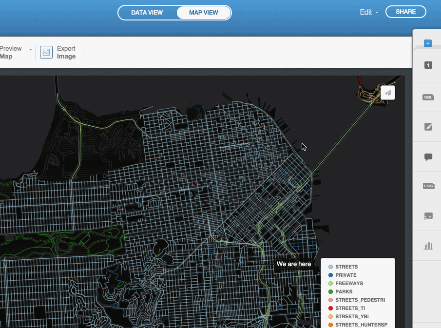
1.3 Tour of the Interface
Data Import
Basic Data Import
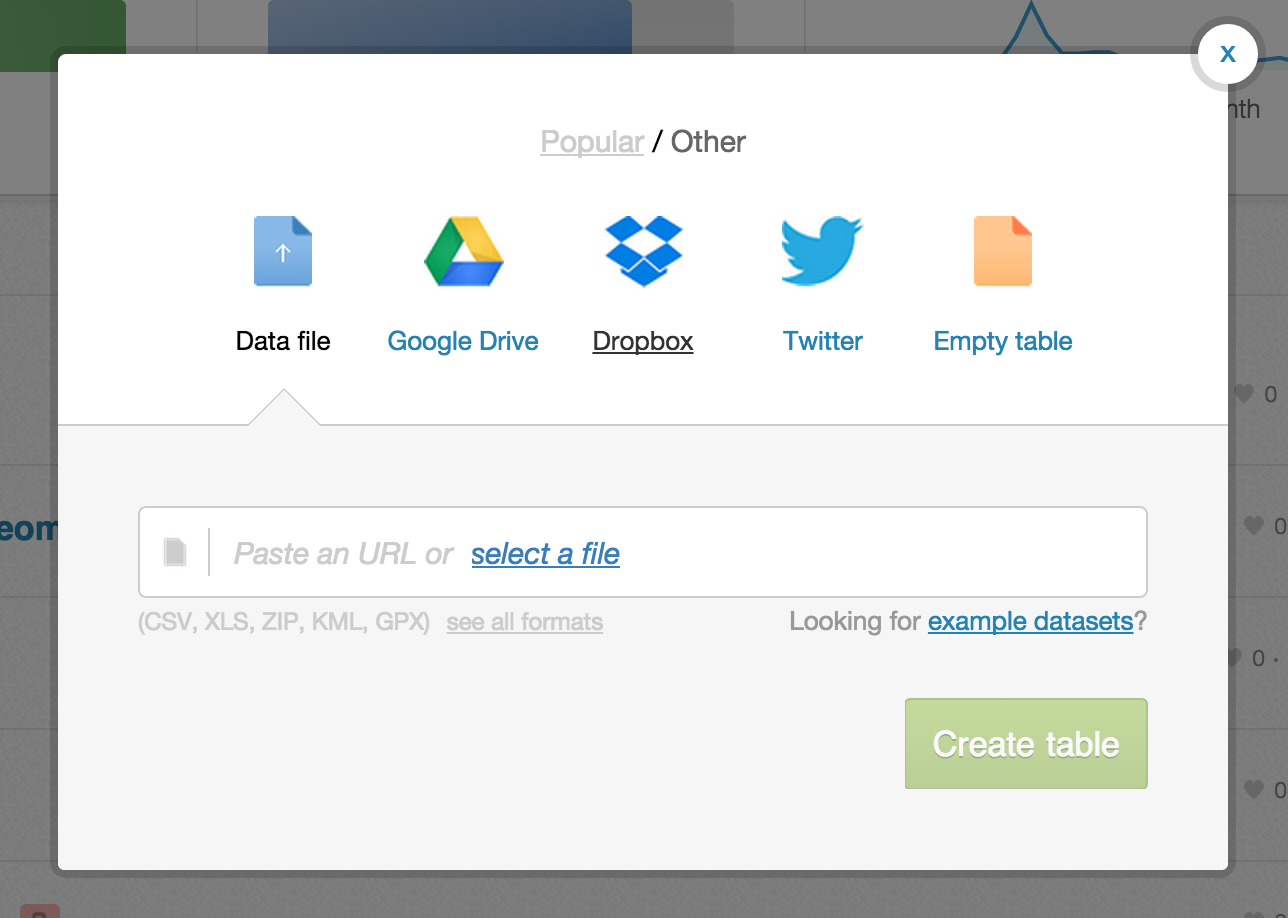 Most major formats for storing data: Excel Spreadsheets, CSV files, Shapefiles, KML (Google Earth), etc. See complete list here.
- Import by URL! Handy when in a workshop and you don’t want to overwhelm the bandwidth :)
- Select file from your computer
- Common Data contains useful datasets for everyday use (admin regions, USGS earthquake data, ports and their locations, and many more)
Integration with Google Drive and Dropbox.
Twitter firehose access for Enterprise accounts.
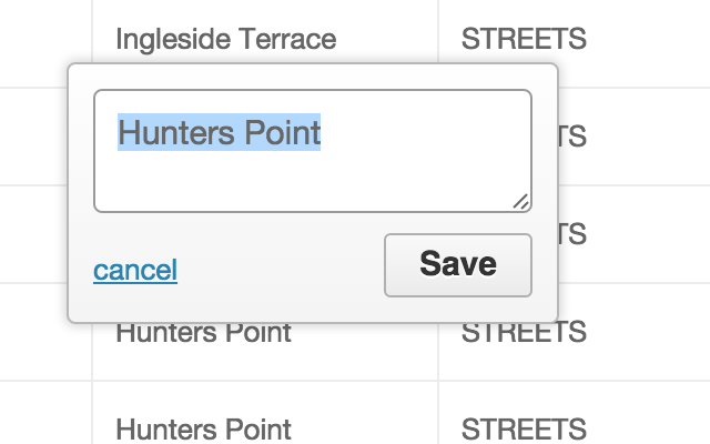
Data tables in CartoDB
Column names

Editing Data point by point
Filters & SQL
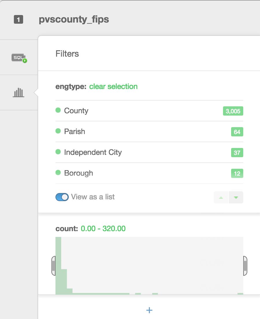
Filters are a great way to explore your data. Besides filtering your data, they allow you to see histograms of the distributions, the number of unique entries, or a search box for columns that have a large number of text entries.
Types of visualizations
- Simple – most basic visualization
- Cluster – counts number of points within a certain binned region
- Choropleth – makes a histogram of your data and gives bins different colors depending on the color ramp chosen
- Category – color data based on unique category (works best for a handful of unique types)
- Bubble – size markers based on column values
- Intensity – colors by density
- Density – data aggregated by number of points within a hexagon
- Torque – temporal visualization of data
- Heat maps – greater color intensity indicate greater density of data
Check out visualization documentation for more.
Data for the following from DataSF.
Simple Map
The visualization style simple is the default visualization for all maps.

Styles available in the wizard
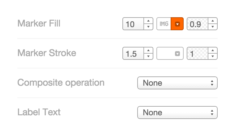
- Marker Fill: change the size, color, and opacity of all markers
- Marker Stroke: change the width, color, and opacity of every marker’s border
- Composite Operation: change the color of markers when they overlap
- Label Text: Text appearing by a marker (can be from columns)
Category Maps
Color features by discrete elements.
Infowindows/hovers
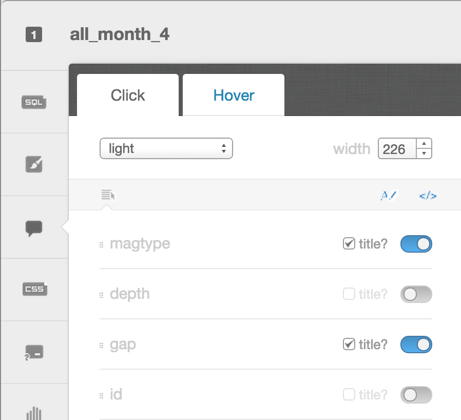
- Select which column data appear in infowindow by toggling column on
- Customize further by selecting
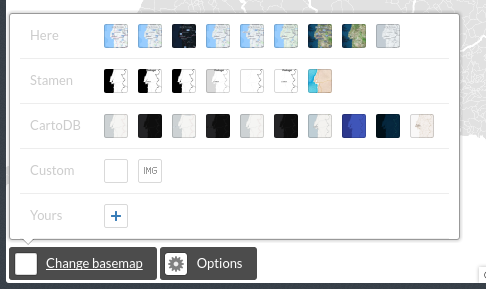
Change basemap
Select basemaps from different providers, use custom color, NASA data, MapBox tiles, etc.
Annotations
Add annotations to your maps:
Choropleth
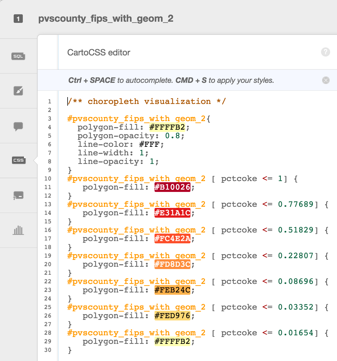
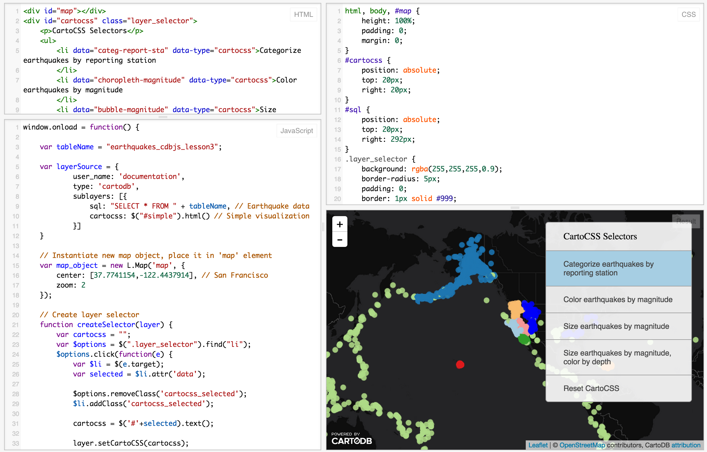
Choropleth maps show map elements colored according to where a value associated with the map element falls in a range. It’s like a histogram where each bin is colored differently according to a color scale you pick. Notice the CartoCSS screenshot above.
Features to notice:
- Column choice of how geometry is categorized
- Number of color bins
- Color ramp choices
Quantification is an option to pay attention to since it controls how the data is binned into different colors. Equal interval gives bins of equal size across the range, which means that outliers stand out. Quantile bins so that each bin has approximately the same number of values. Heads/tails works well for data that has more of an exponential characteristic. Jenks is best for data that has some clustering to it (i.e., it’s multimodal).
CartoCSS basics
CartoCSS is the styling language for our maps.
Legends
Can be easily customized
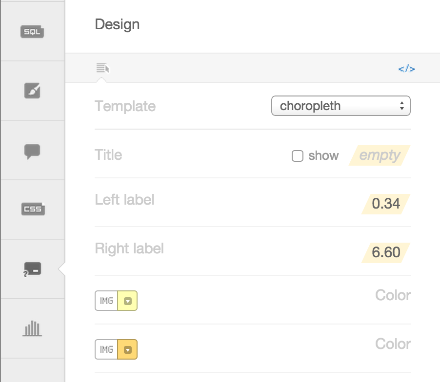
You have the option of giving it a title, and changing the text for the colors. You can also change the colors manually, or, even better, change the color ramp back in the wizard. If you want to explore other color ramps, check out Color Brewer for some very well thought out color schemes.
Torque maps
CartoDB created a fully zoomable map that changes in time.
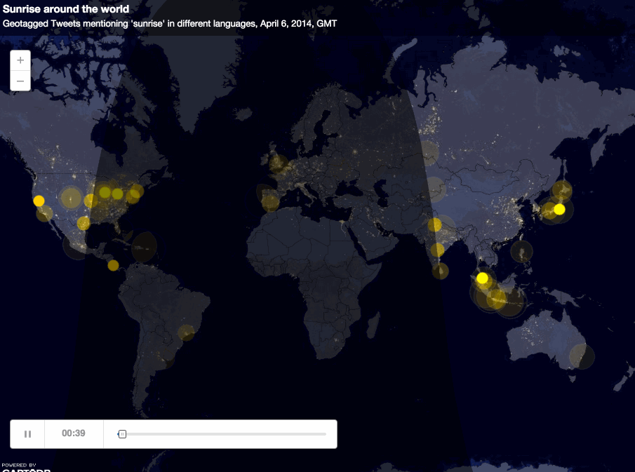
Some examples
- World Cup tweets saturate this map
- Tweets that mention sunrise map (captured in an animated gif above)
- Animal migration patterns
- Alcatraz Escape revisited
Sharing/publishing your maps
You can share your maps by doing this in a visualization:
Last few things
Navigating back to your tables or visualization
Click on the 90-degree arrow to get back to view your tables/visualizations
![]()
Navigating in general

2. Hands-on Mapping Workshop
Let’s make maps.
If you don’t have an account setup, go here: https://cartodb.com/signup?plan=academy
Otherwise, login to your account.
Data Import
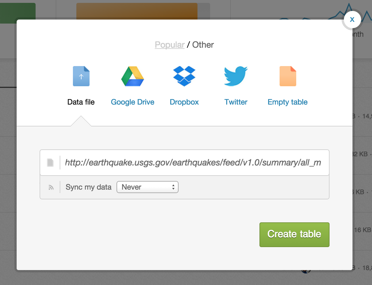
Import a new dataset by copying the link (not downloading) and pasting it into the import window in your CartoDB account:
USGS reported seismic activity (earthquakes) http://earthquake.usgs.gov/earthquakes/feed/v1.0/summary/all_month.csv
2.1 Simple Map
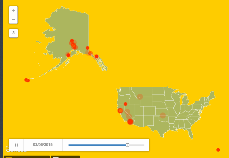
Challenge #1
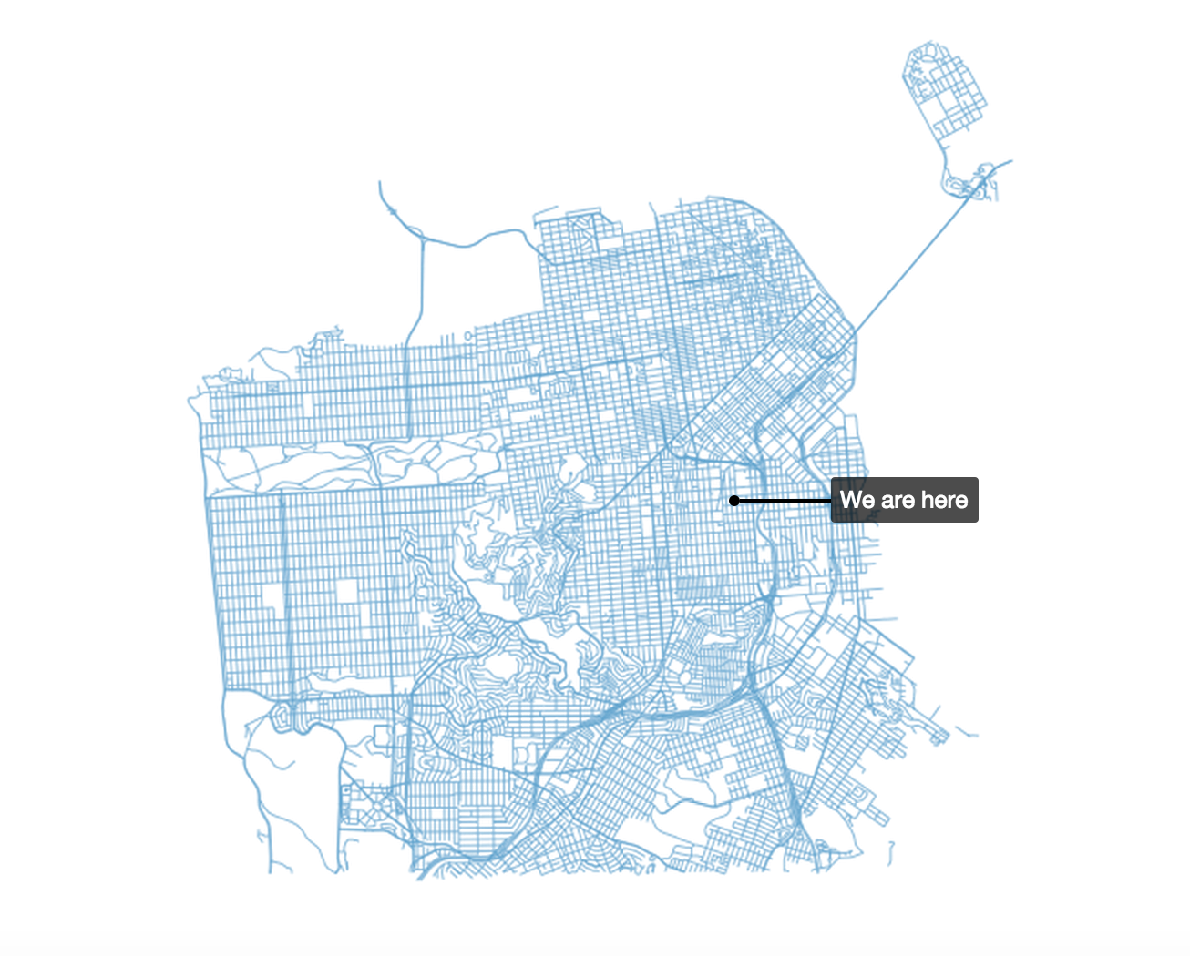
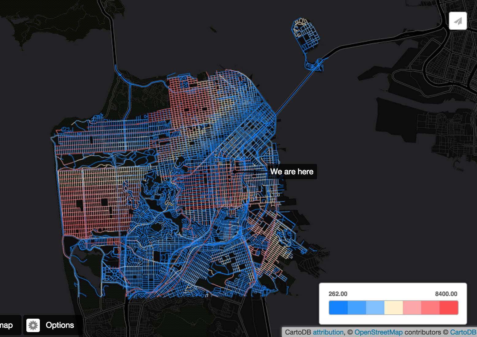
Using the styles in simple, try to recreate the visualization below. It’s similar to an intensity map that shows where earthquakes are occurring in largest numbers.
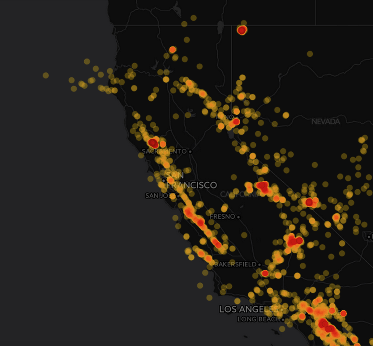
For later reference, here’s more on quantification.
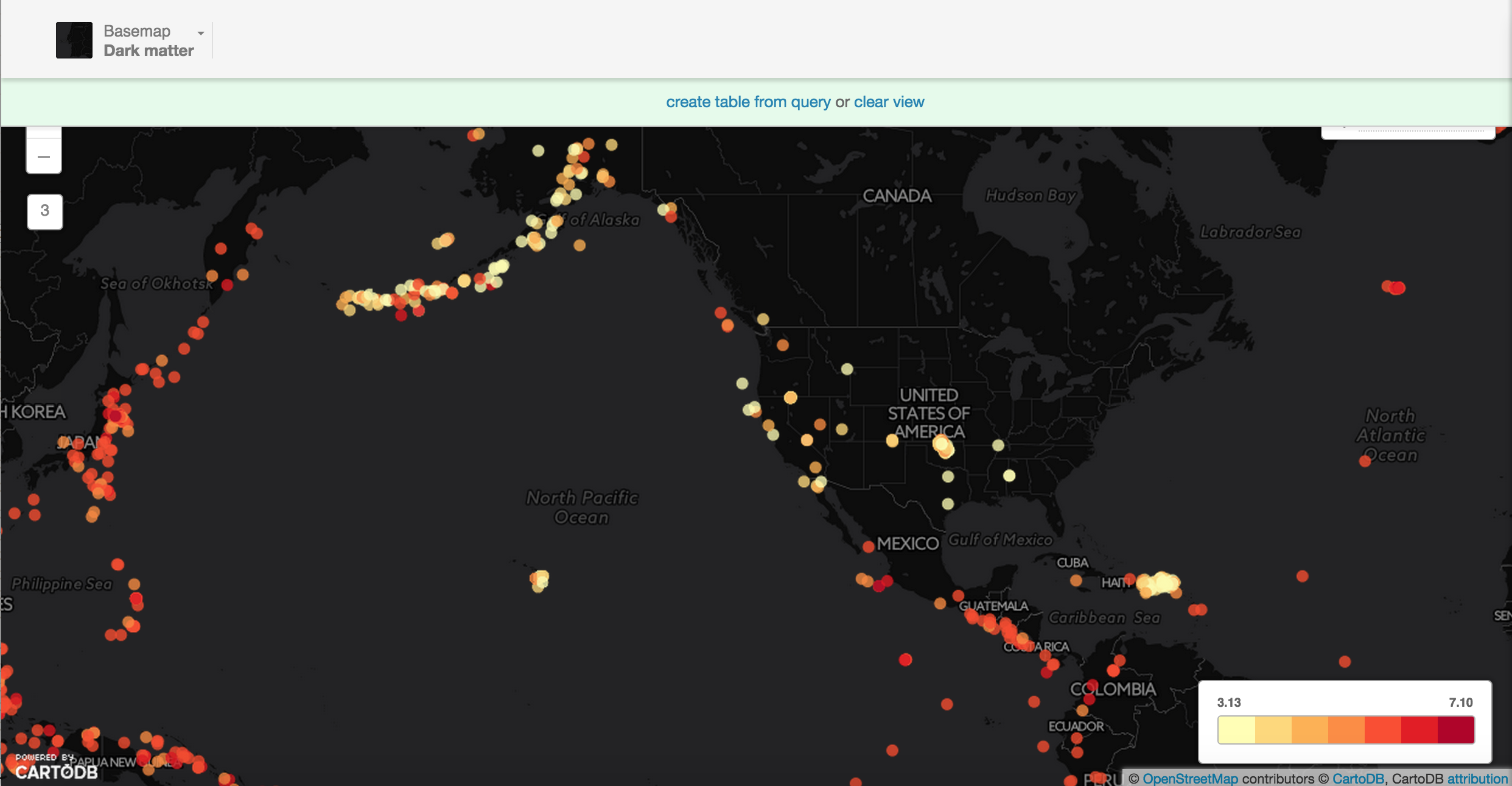
2.2 Choropleth Map
Challenge #2
Make a choropleth map
Next select choropleth from the Vizualization wizard. By default it will select depth. Select the mag column (which means magnitude or power of the earthquake).
Notice that there are lots of US-based earthquakes that are fairly weak – so perhaps filtering for earthquakes above 3.0 will give a better visualization of our data.
hint: notice that a filter was used
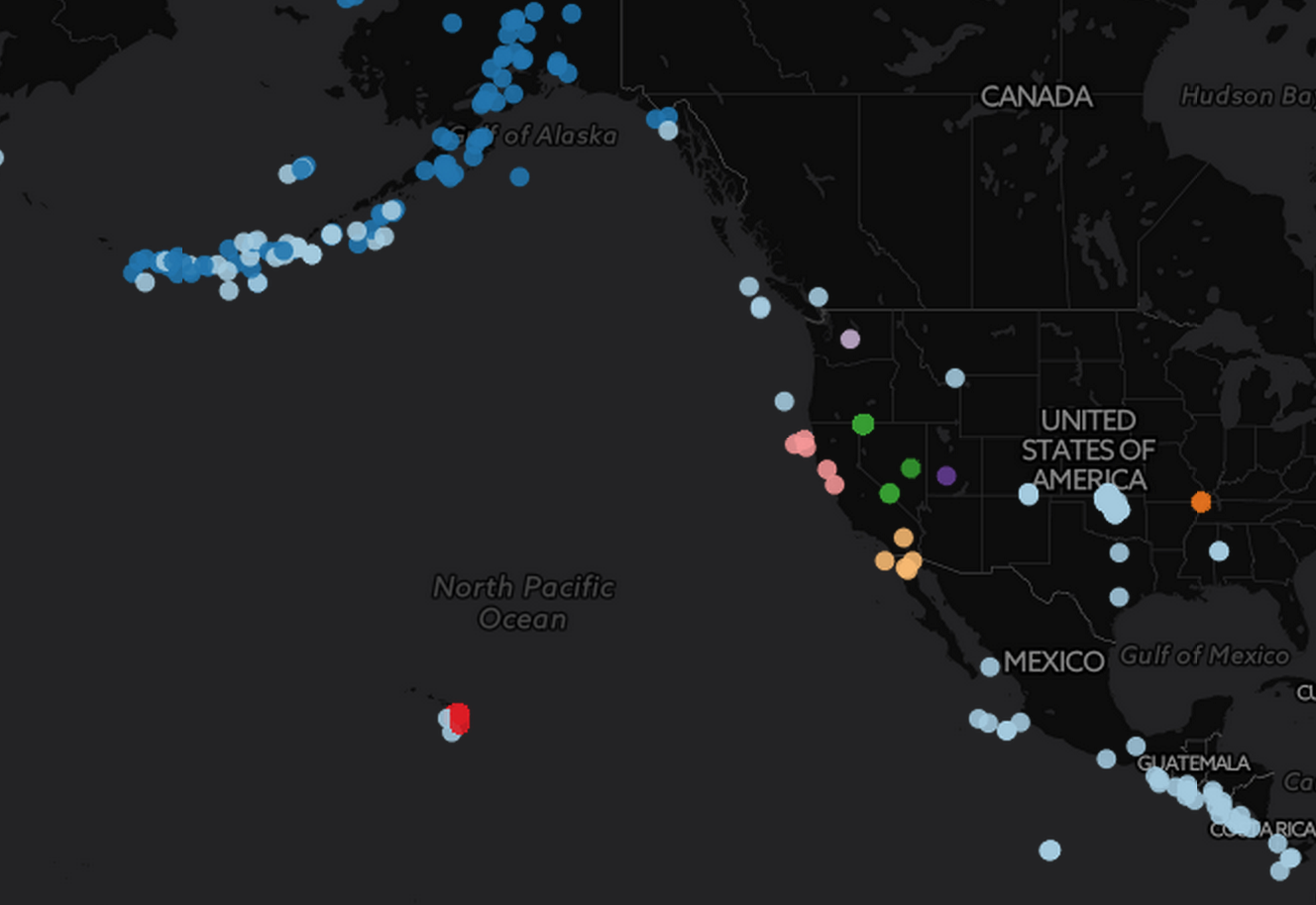
2.3 Category Map
Challenge #3
Try to recreate this map using category. net is the column to categorize by…
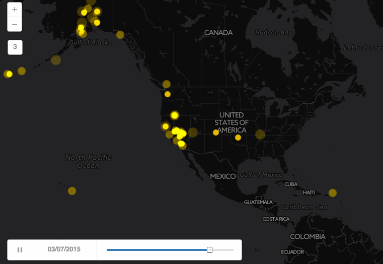
2.4 Torque Map
Challenge #4 – Create a basic torque map
Create a torque map that looks like the one below. Hint: Select the time column of the earthquake data.
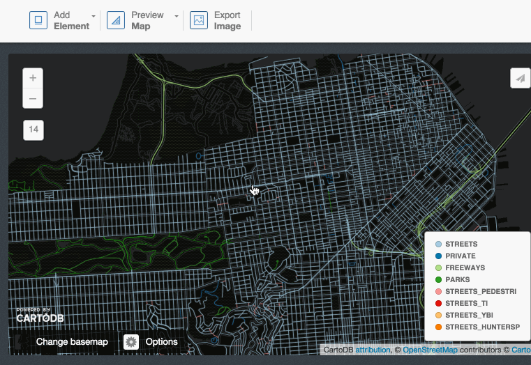
2.5 Multilayer map
Three basic types of data appear on a map.
- Point data – like we saw for the earthquakes
- Line data – like flight paths, can be seen in this example
- Polygon data – like the shapes of states
Go back to your dashboard and click on Common Data. Find Administrative Regions, then click on USA States.
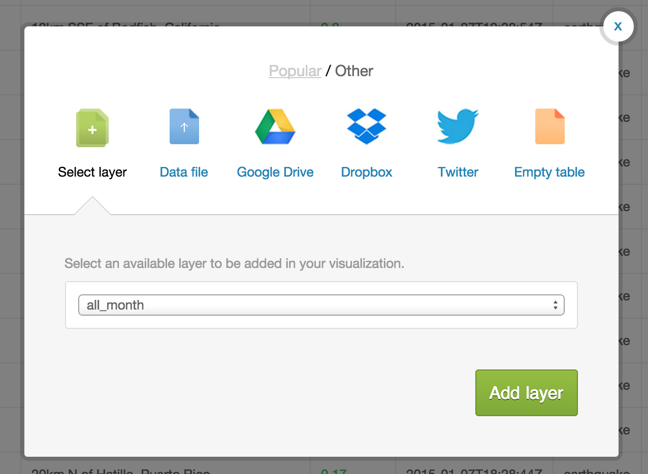
After the data imports into your account, click on the large + on the panel on the right side of the page.
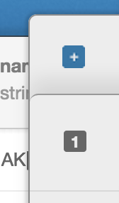
Select the earthquake dataset. It’s default name on import is all_month. Then hit Add layer and you will get this:
Name your visualization something fancy.
You can customize each layer just as you would customize a single layer.
Try to create a map that looks like this:
Multilayer Resources
- CartoDB Map Academy lesson on making multilayer maps in the editor
- Recent blog post about how to create one with layer selectors (legends are responsive to shown layer)
Journo examples
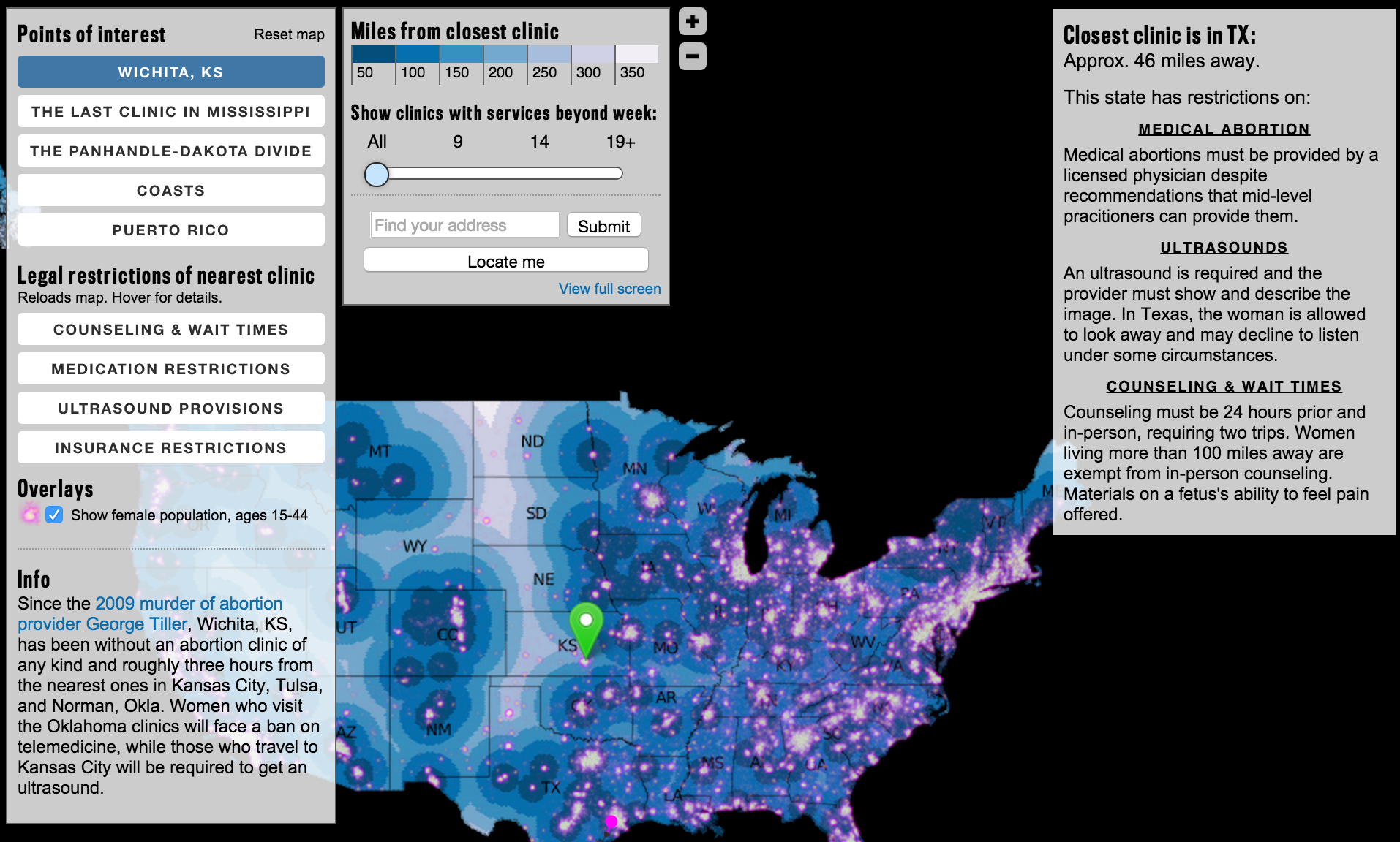
- Multilayer tool developed by The Daily Beast on Abortion Clinic Access.
3. CartoDB.js
CartoDB.js is our JavaScript API – a way to make maps using JavaScript.
3.1 What it looks like
The example above uses HTML, CSS, and JavaScript to make a map appear on a webpage.
Check out our Map Academy course on CartoDB.js if you want to learn more.
3.2 Extensibility
Use CartoDB.js with other JavaScript libraries to make powerful web map apps.
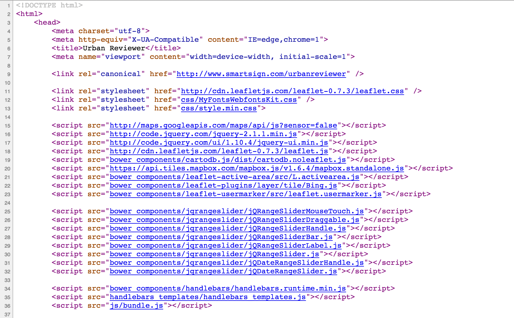
Check out Urban Reviewer.
If you take a look at the source code, there are a dozen libraries linked:
3.3 Epic Example
Illustreets shows standard of living information across England to amazing detail. There are millions of data points, each can be interacted with to give graphs, summaries, etc.
4. Odyssey (if we have time) – Telling narratives with map visualizations
Odyssey is in the process of being brought to Editor like other visualizations. For now, play in the sandbox.
Examples
- NY Daily News: 48 Hours of Gun Violence
- Cadena Ser (Spanish radio): The Sounds of 11M
- Al Jazeera: Israeli-Palestinian Conflict by Tweets
Getting started!
Go to: http://cartodb.github.io/odyssey.js/sandbox/sandbox.html
Brief tour of the interface.
Replace the header in the box on the right with this:
- baseurl: "http://a.basemaps.cartocdn.com/light_all/{z}/{x}/{y}.png"
- title: "Percent of people that say Coke"
- author: "Your name"
- cartodb_filter: ""
- vizjson: "http://andye.cartodb.com/api/v2/viz/944f113c-95d5-11e4-a3a2-0e4fddd5de28/viz.json"
If you want to add your own vizjson file for another visualization, go to the visualization you want to use in the CartoDB Editor, click on Share in the upper right hand corner, and copy the link under CartoDB.js. You can now paste that link in place of the vizjson link given in the above example.
I’m using a different base map (baseurl), changing the title and author, and adding a data layer by adding the vizjson and cartodb_filter portions.
If you want to add images use the following format:

Example:

5. Wrap Up
More resources
My contact: eschbacher@cartodb.com
If you make a map you’re proud of or just want to say hello, connect with me @MrEPhysics.