Introducción a CARTO y BUILDER UpSociative
- Trainers: Ramiro Aznar · ramiroaznar@carto.com · @ramiroaznar
- November 23th, 2016
http://bit.ly/161123-upsociative
Introduction
Prerequisites
- Laptop
- A modern browser (Google Chrome would be perfect)
Resources
You can take a look on those resources if you want to warm up with CARTO
Support
- Email to support@carto.com.
- Some questions could be already anwered at GIS Stack Exchange
cartotag.
Contents
Setting up
- The instructors will provide you a user and passwor to access your account
- Log into your
upsoc-cartoXXaccount going tohttps://carto.com/login
1. Getting started
1.1. Create a map
- Click on
NEW MAP. - Clik on
SEARCHand type “world borders”. - Select
world_bordersdataset. - Click on
CREATE MAP. - You can rename the map and layer title as “Countries & Cities” and “Countries” respectively, doing double click over them.
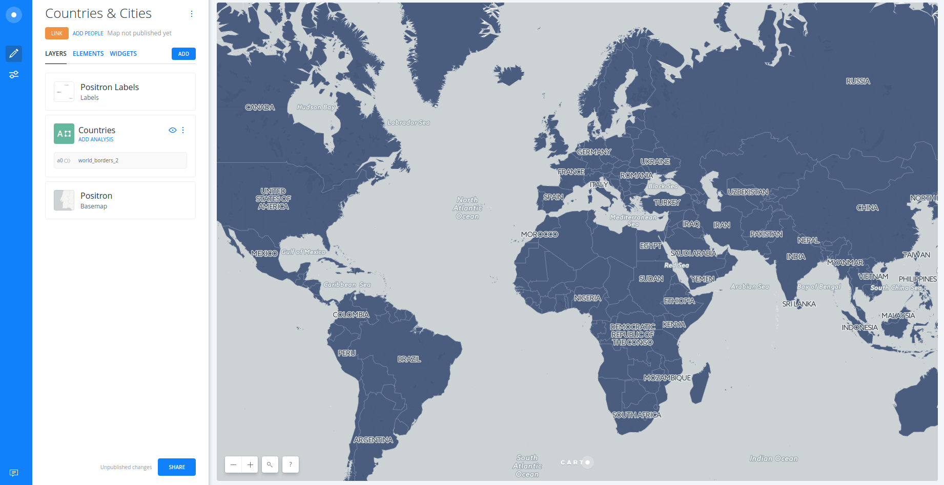
1.2. Layers
- Add a new layer:
- Click on
ADD. - Click on
SEARCHand type “populated places”. - Select
ne_10m_populated_places_simpledataset. - Click on
ADD LAYER.
- Click on
- You can rename the title of this new layer as “Cities”.
- Click on the layer to show its components:
DATAANALYSISSTYLEPOP-UPLEGEND
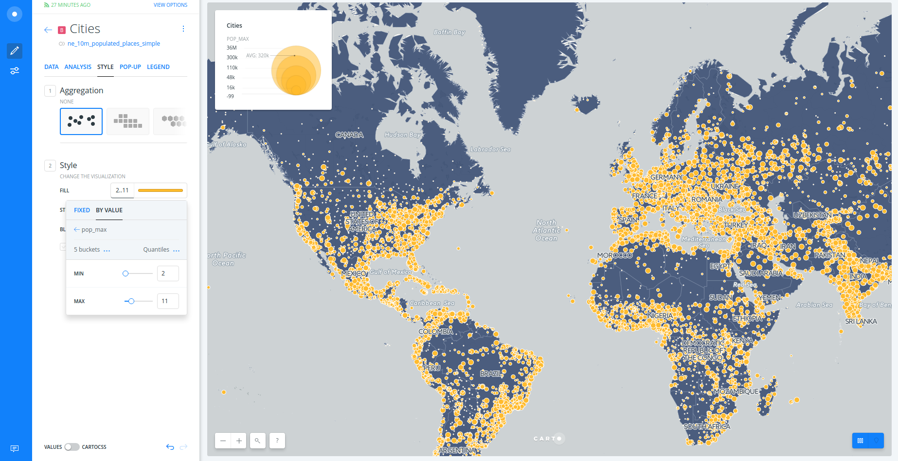
1.3. Styling
- Create a bubble (proportional symbols) map:
- Click on
STYLE. - Click on point-size number.
- Select
BY VALUE. - Select
pop_maxcolumn.
- Click on
- Create a chroropleth map:
- Click on
marker-fillcolumn. - Select
BY VALUE. - Select
pop_maxcolumn. - You can customize your map further changing (and flipping) a different color palette, the number of buckets and quantification method.
- Click on
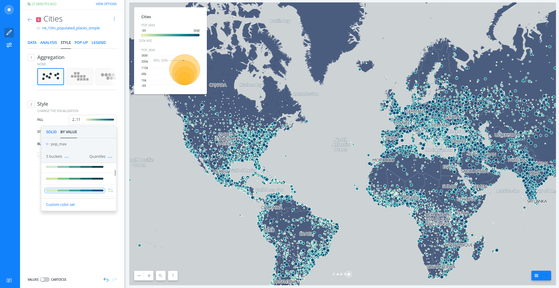
- To learn more about how this works behind the scenes check out the CartoCSS panel.
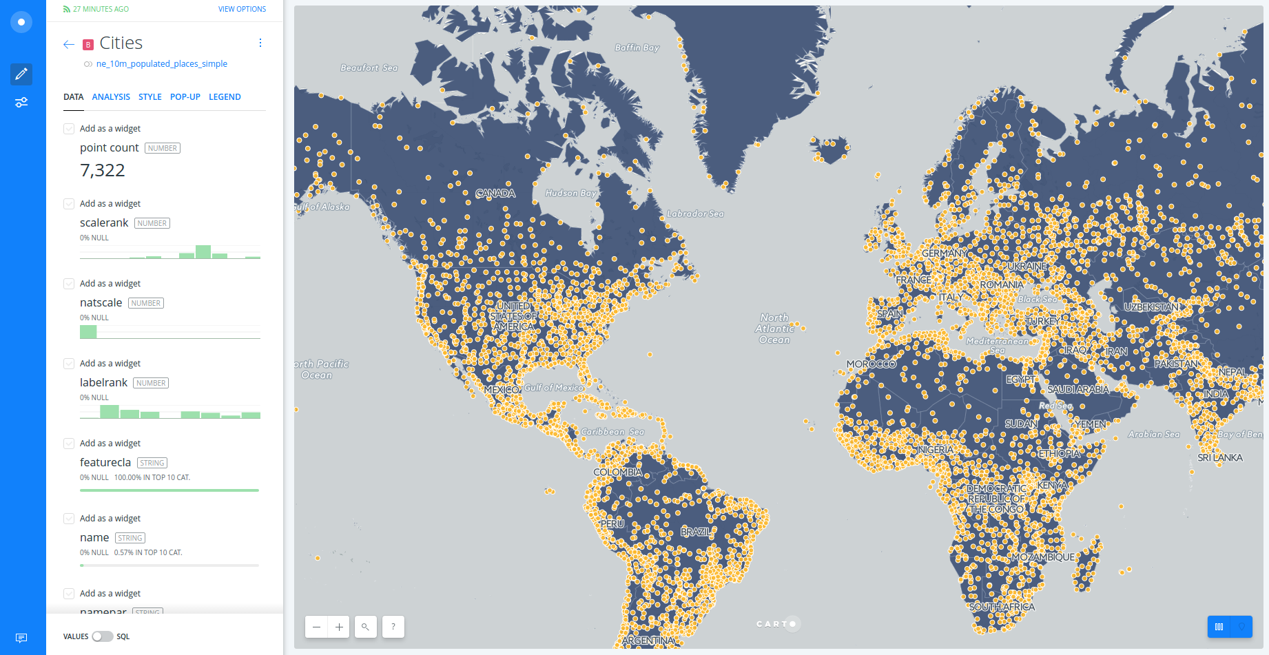
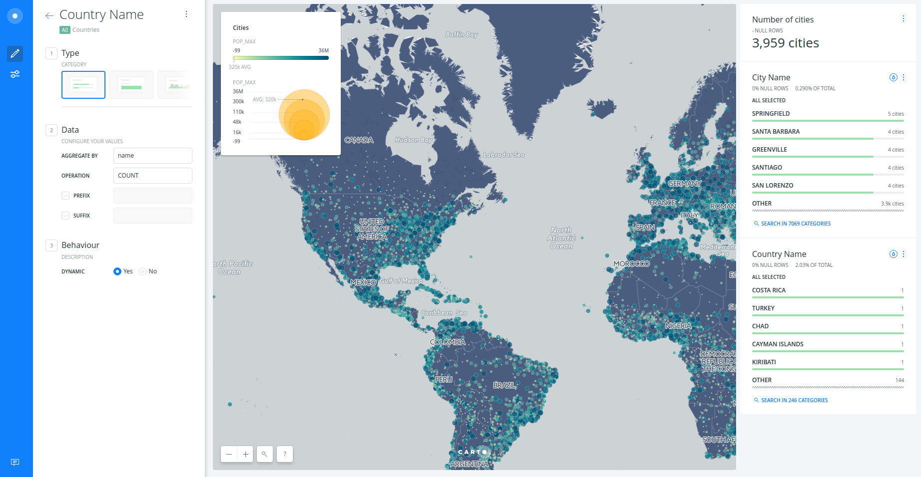
1.4. Widgets
- Add widgets to “Cities” layer:
- Click on
DATA. - Select
point countin order to show the number of cities. - Select
namein order to filter by city name. - Click on
EDITin order to customize both widgets.
- Click on
- Add widgets to “Countries” layer:
- Click on
LAYERS. - Click on “Countries” layer.
- Click on
DATA. - Select
namein order to filter by country name. - Click on
EDITin order to customize both widgets.
- Click on
- Now you can filter and autostyle by country and city name.
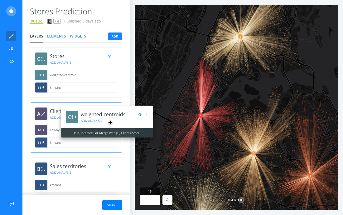
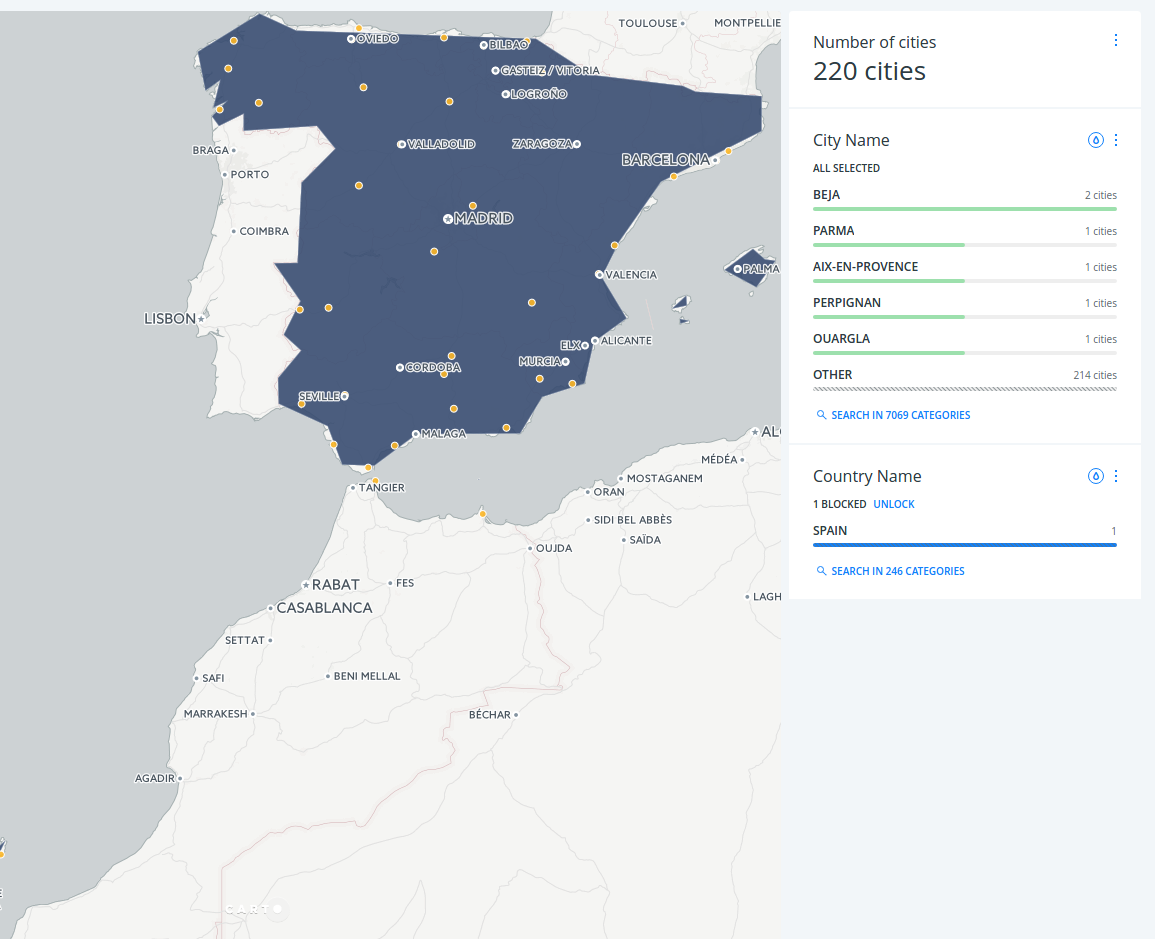
1.5. Analysis
- Go back to the main menu.
- Click on
ADD ANALYSISjust below “Cities”. - Select
Filter by layeranalysis. - Click on
ADD ANALYSIS. - Set the parameters as follows:
FILTER BY LAYER: “Countries”.SOURCE COLUMN:sov_a3.FILTER COLUMN:iso3.
- Click on
APPLY. - Now fitering by country, you are also filtering the cities within that country.
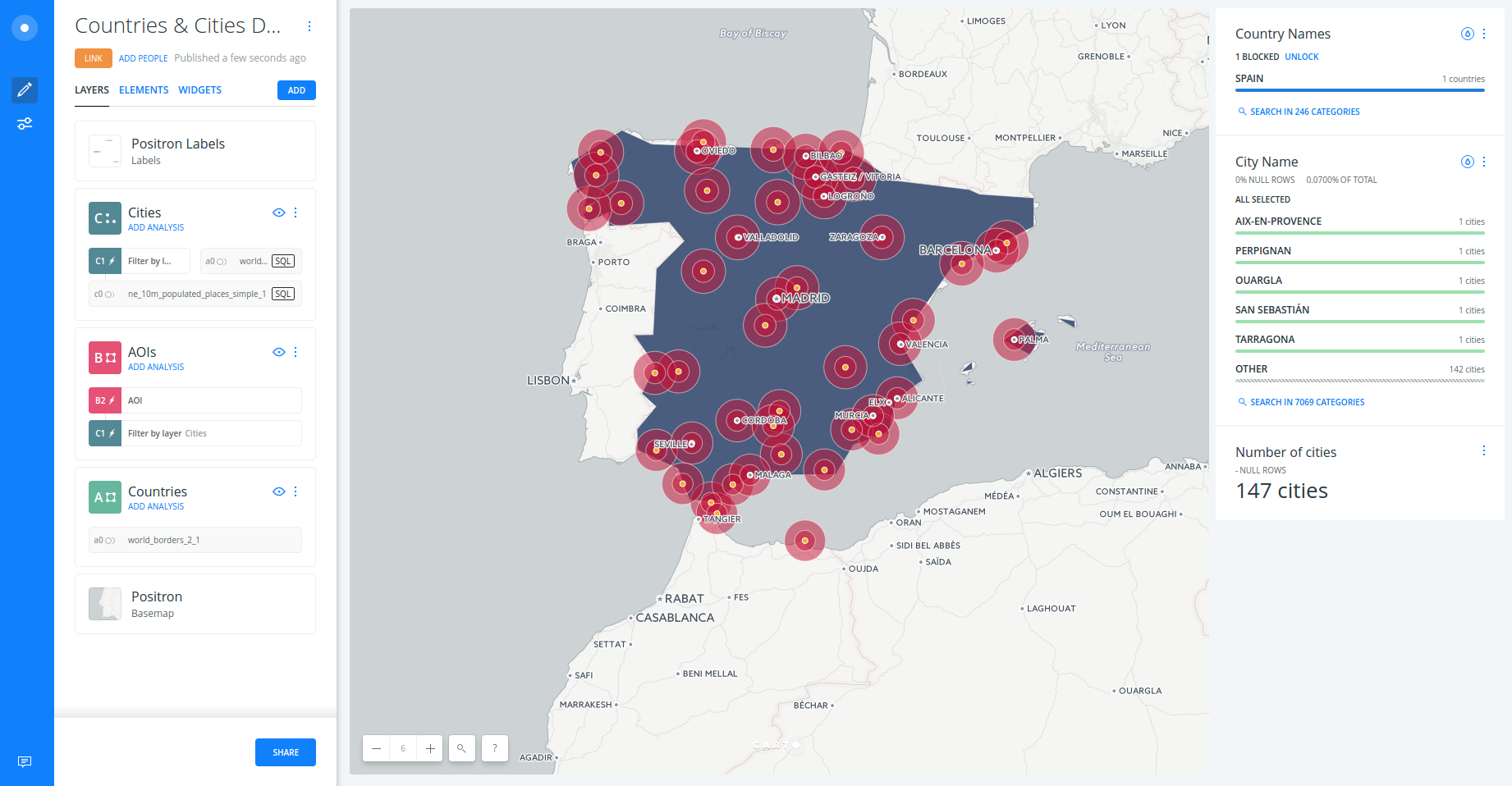
- Click on
+to add a new analysis. - Select
Create areas of influenceanalysis. - Click on
ADD ANALYSIS. - Set parameters as follows:
- TYPE: “Distance”.
- UNITS: “Km”.
- RADIUS: “50”.
- TRACTS: “2”.
- BOUNDARIES: “Intact”
- Click on
APPLY.
*Bonus:
- Drag and drop out the “Filter by layer” node in order to get the points back.
- Style the new AOI layer and filter by country using widgets.
1.6. Publish
- Click on
SHARE. - Set to
LINKorPUBLIC. - Click on
PUBLISH. - Now you can share the map as link or embed.
2. Demo: Risk Analysis
2.1. Use Case
-
Let’s take a look at BUILDER and see how we can use this new tool to power our analysis. In this particular use case we are going to look at risk. How to determine what areas by county in the US have a higher risk for insuring railroad companies.
-
We have a freely available dataset that the Department of Transportation publishes that tells me where across the US over the las 4 years there have been railroad accidents and the associated damage or cost of each of these incidences.
-
As an insurance company, I may be approached by different railroad companies and they want to understand how much it would be cost to insurance their equipment. So part of our analysis today would be to look at this data and determine the areas of the highest risk across the US.
2.2. Instructions
Connect dataset
- Copy and paste this url into your browser:
https://builder-demo.carto.com:443/api/v2/sql?q=select * from "builder-demo".dot_rail_safety_data_1&format=gpkg&filename=rail_road_data.gpkg. - Wait until the dataset is downloaded.
- Click on
NEW MAP. - Click on
CONNECT DATASET. - Click on
BROWSEand select the file (or drag and drop it). - Click on
CONNECT DATASET. - Rename title and layer names.
Style dots based upon the total damage
- Click on the railroad layer.
- Click on
STYLE. - Style dot width based upon
total_damagevalue.
Filter by railroad companies and dates
- Click on
DATA. - Add
railroadanddatewidgets. - Filter by railroad company and/or date range.
Add US counties dataset
- Back to the main menu, click on
ADD(layer). - Click on
DATA LIBRARYand type “us counties”. - Select
cb_2013_us_county_500kand click onADD LAYER. - Rename the new layer.
- Drag and drop the railroad layer above the counties layer.
Intersect US counties with railroad accidents
- Click on counties layer.
- Click on
ANALYSIS. - Select
Intersect with 2nd layeranalysis. - Click on
ADD ANALYSIS. - Set parameters as follows:
- Railroad layer as
TARGET LAYER. SUM(total_damage)asOPERATION.
- Railroad layer as
- Click on
APPLY. - Back on the main menu, click on
WIDGETS. - Click on
HISTOGRAM. - Select
sum_total_damage. - Click on
CONTINUE.
Clustering
- Click on counties layer.
- Click on
ANALYSIS. - Select
Detect outliers and clustersanalysis. - Click on
ADD ANALYSIS. - Select
sum_total_damageasTARGET COLUMNand leave the rest of parameters with the default values. - Click on
APPLY. - Back on the main menu, click on
WIDGETS. - Select
quads. - Click on
CONTINUE.